Did The 500 Richest Bitcoiners Buy the Highs AND Lows?
Latest NewsPublishedDec 25, 2014
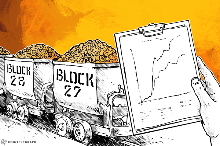
A chart of the 500 Bitcoin addresses with the highest balances shows that all or most of them increased their holdings at every price (from the US$1 bitcoin to the US$1,100 bitcoin).
A chart of the 500 Bitcoin addresses with the highest balances shows that all or most of them increased their holdings at every price (from the US$1 bitcoin to the US$1,100 bitcoin).
But what does the chart, generated by BitcoinRichList, really mean?
At first glance, I assumed the data meant that I have something in common with Bitcoin’s millionaires (in that I’ve also purchased cryptocurrency over time regardless of price) but it turns out that I may have been mistaken.
Pool Addresses
Reddit user natri said:
“Top 500 addresses mostly consist of ‘pool addresses’ that contain bitcoin from several individuals, such as money on exchanges, payment processors, gambling sites, mining pools etc[. . .] Because in time (with number of blocks) the total amount of bitcoin increases, so does the amount accumulated in those top 500 addresses as there’s more bitcoin in circulation and on the market.”
Maybe none of the top 500 richest addresses belong to individuals, but are rather the collected funds of many people. But that still means one of two things must be true: either the individuals using these pools were still, in fact, increasing their holdings, or more people were joining the pools as new Bitcoin adopters.
Elimination of the Perma-Rich Class?
An economic indicator that an economy is socialist (either communist or fascist) is that the makeup of the wealthiest class of people rarely changes—when hardly any newcomers join and hardly any existing members fall from rank. A permanent financial elite is usually a sign of a society where barriers have been erected to suppress competition.
Though Bitcoin is still a baby at only six years old, does the graph give a hint at the kind of economy it might spurn? Reddit user waxwing says:
“That graph could be misleading if it’s counting the proportion of BTC held in the top 500 addresses at any one time, without checking whether they are the same address at all times.”
The graph simply doesn’t indicate whether the top 500 addresses are the same addresses over time or not. If they’re not, that indicates that no permanent financial elite is forming, and that Bitcoin has little to no barriers to entry.
The Takeaway
A deeper analysis would need to indicate whether the top 500 addresses were the same addresses at every data point or not. And more revelatory to assessing Bitcoin growth would be the number of new users on crypto gambling sites, exchanges, wallets and mining pools (instead of just the Bitcoin balances).
Until that information is acquired and published, the most we can do with the graph is have fun speculating. But we’re digital currency traders—that’s what we do best.
Did you enjoy this article? You may also be interested in reading these ones:

Subscribe to daily byte-sized crypto news from Cointelegraph
Cointelegraph is committed to independent, transparent journalism. This news article is produced in accordance with Cointelegraph’s Editorial Policy and aims to provide accurate and timely information. Readers are encouraged to verify information independently.
More on the subject